Blog "Fast Dynamic SEO" Before Creating a Website. The Website Structure And Page Layout
21th October, 2018
By website structure I mean the relationship of its pages to each other. Defining it helps greatly to determine what scheme and design are optimal in a given case. When a visitor enters the website, four major questions should be answered as soon as possible.
- Where am I? What is all this site about? What is this page?
- What is interesting for me here?
- Why is this offer better than others?
- How do I get what is offered here?
All this determines the structure by which our future website will be formed, and whether it will be able to lead the visitor as if holding his hand, from the first positive impression with an attractive picture to a detailed explanation to him, already convinced, how to buy this wonderful product so necessary for him.
Let me remind you that this is a second part of the article “Stages of creating a website. Before you start”. In which we have looked in detail what information you need to prepare to have it on the site. Now we are going to analyze how and where on the site you need to post this information. This article is aimed primarily not for designers developing sites, but for business owners who are just thinking about getting a site or want to remake the existing site to increase its profitability.
Why Do You Need a Website?
This is the question that you have to answer yourself and that will determine the structure of the site. The statistics of surveys of business owners is approximate as follows:
- 38% - Dissemination of information about the site
- 28% - Attracting customers to our store salon office
- 15% - Demonstration of our goods and services
- 11% - all of the above
- 6% - acceptance of orders online
- 2% - customer support and feedback
Most people have a desire to make your website profitable, but only 6% have clearly formulated this task for themselves.
Phone with Internet access becomes our third hand and any question that arises for most people, they ask immediately in the search. The ability of your site to sell services and products directly online or at least to give the client an easy opportunity to request or contact you definitely increases the flow of customers.
How to structure
In order to make our structure clear, you can use simple tools such as a sheet of paper and a pen. Draw our elements and arrows, as a visitor should move through our site. Again, from the answer to the question "Where he got" to detailed instructions "How to buy the product." of course you can use different graphics programs, but this is unnecessary. The main thing for the competent usability and efficiency of our site all boils down to the answer to the above four questions.
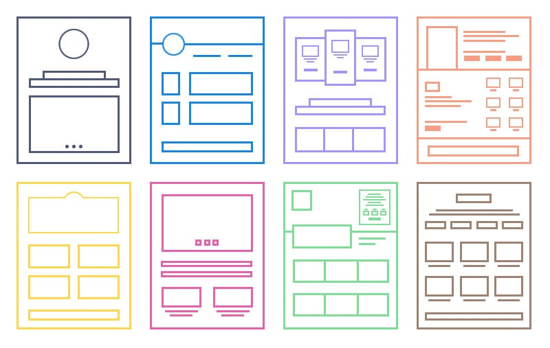
Page Layout Levels
Site pages can be of different nesting degrees. The level is determined by the degree of importance. So does section and subsection. With proper structure, all this corresponds to the importance of the page and is displayed in its address. That is, the “deeper” is the page, the less important it is. Both for search engines and for the user. The number of nesting levels is not limited. But the deeper you place the information, the harder it will be to find it. There is a rule of "3 clicks". It is not a dogma, but a recommendation:
"Any page should be available in 3 clicks.”
This is based on the laziness of site visitors. After all, if a possible client comes to the site and can't quickly find the information, he doesn't become a client. Еach click is another 2-5 seconds waiting for pages to load. So the most important information should be located at the distance of the 1st click. At least 2nd. If there are more, then you do not consider this information important. a potential customer simply can not find it and with a probability of 90% will leave the site. Nevertheless, everything depends on the amount of information posted on the site. Therefore, when creating a site structure, there are several points you should keep in mind.
The structure of the site should be logical. Don't overdo it or overcomplicate it. The site needs simplicity, both for visitors and search engines. Each category must be unique and distinct. The subcategory must correspond exactly to the section in which it is located. If a subcategory belongs to more than one category, it is most likely not a subcategory, but simply a parameter of a product or service. Try to keep the number of primary sections from 2 to 7. If you get more, try to rethink the structure and tweak it a little. Number 7 is based on the psychological perception by a person of different factors simultaneously. The number of subcategories in each section is also desirable to keep within a balanced number. If there are 14 subcategories in one section and 3 in the other, you may have missed something.
Structure Options. One-Page Website
The simplest variant of the site structure is a one-page site. The main page (which is the only one) contains all the necessary information and if the page is not overloaded graphically, it will load quickly. After all, very often (depending on the internal settings of the site), until the page is loaded completely it is not displayed. Or it is displayed partially, but not in the best way. Therefore, page load speed is a very important factor (Read more: List of SEO ranking factors and signals).
Most often, if you do not run a large company, the one page would be sufficient. It allows you to guide the user very precisely from what he sees at the beginning to all the necessary information. In addition, long pages have a positive effect on the “user experience”. People are used to newsfeeds in social networks and because of the use of phones are accustomed to this easy “swipe up” to scroll the page. It is much more convenient for the user than to click on small items on the menu. Especially on phones, when in 90% of cases the menu is hidden. And in order to open it and click on the link of another section, the user has to make an additional click to open the menu button.
Structure Characteristics
People tend to view or "scan" content quickly. It requires less mental effort than reading the whole article, so we quickly run through the text with our eyes until we find something interesting. It is therefore necessary to split the content into so-called scrolling points. The inability to break the text into key points causes a phenomenon called "scrolling fatigue". It can lead to two results: "Zombie scrolling": the user gradually loses concentration and reacts less to the "bait" in your CTA (call to action). Rage-quitting: the user gets irritated because of the long scrolling and leaves the site, without grasping the key points.
Present the content correctly
The first way to encourage scrolling is to organize the content so that it is easy to scroll. Here are optimization suggestions:
- 1. Strong start: an interesting introduction will grab readers and encourage them to scroll through the article. Immediately give some idea, the development of which will happen further in the text — so they will have a reason to read.
- 2. Throughout the article, throw in important facts for the audience and highlight them. The more important these details are, the more likely users will continue to scroll.
- 3. Matching pictures help break up content and keep readers interested.
- 4. Beware of the false bottom effect. This phenomenon occurs when users think that there will be no more content below what they see now. of course, the top area contains the most basic information, but it is important to make it clear that there is further valuable content, access to which is provided by scrolling.
Tree Structure
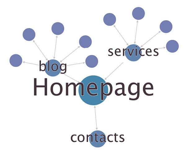
When you create your structure, start with a one-page option. Form a user path and try to put all the information on one page. I say “try it" because sometimes you have a lot of useful information and you have something to share. Then you need to go deeper. Create a subsection that describes given part as much as possible. And on the main page, leave a small block with input data that can attract a visitor so he will be able to learn more about some part of your work on a separate page.
Can You Really Benefit From a Large Website?
When expanding your site with additional sections, you should follow the “one topic” rule.
“Each page reveals only one topic”
The title of the page or section should correspond to what the visitor will see. This seems obvious, but not everyone follows this rule.
It is desirable that the main title on the page exactly corresponds to the title written in the code.
Also, the formation of pages due to the rule of "one topic" helps to further promote this page in the search.
In a tree structure, it is very important to maintain a balance between the number of “branches” and the length of these “branches”. A large number of sections can confuse the visitor. Too strong “immersion" will tire him if he needs to move to some other section.
The simplest option of the tree structure is when there is only one nesting level. You should only go deeper if you really have something to tell. For example, you might want to break your blog into different subsections, but only when the number of articles exceeds a reasonable amount, for example 15-20 pieces. Then on the main page of the blog we will make a description of the blog sections, a search form and a block with the latest articles.
Page Layout
Now let's talk about the layout of the pages of your site. Given that most of the links that you will post on the Internet will lead to the main page, then we will analyze the schemes using the example of the main page.
The task of each site is to lead the user to the desired action. According to research, a potential buyer goes through 5 main stages:
AIDAS: Attention => Interest => Desire => Action => Satisfaction
At each stage a visitor may want to leave your site. Therefore, you need to keep his attention through all the stages. How is it implemented on the site?
Any marketing campaign must begin with determining the unique characteristics of the brand. It is necessary to clearly formulate how the proposed product differs from others represented by competitors. The notion of USP is paramount and we have discussed how to form it in the last article.
First Screen
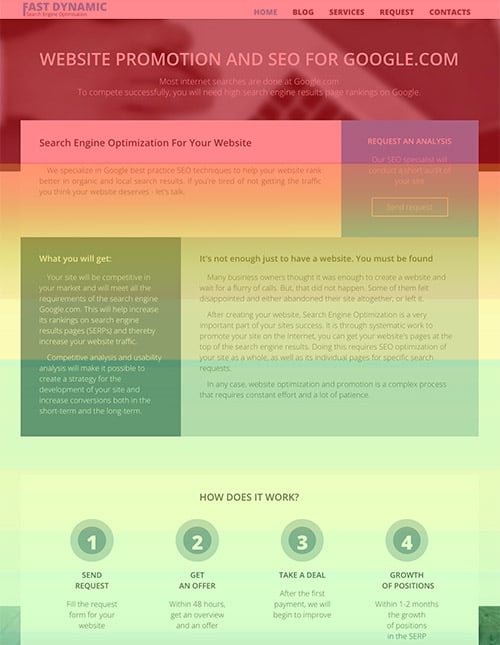
The top part of the site that the visitor sees when entering the site should be used to capture the visitor's attention and arouse his interest.
Here it is necessary that the main title was concise, attractive, selling and rather short. A person should read it with one glance. This should be your UTO.
Unique Trade Offer (UTO) is 6–8 words, which formulate the whole essence of your offer to the market. The conversion of a page largely depends on these eight words.
The subtitle is added when it is necessary to clarify the main offer. It is often used to shorten the main title.
Also on the first screen, it is important to gain visitor confidence. The presence of a telephone and a physical address is quite a strong trigger. The visitor understands that ordinary people work here; they are available to communicate, they are waiting for a call, there is no catch.
It should take about 5 seconds for a user to understand what is the page is about.
Having figured out where he got, and seeing your offer, a person will wonder how to get your product or service. That is why the main page should be designed with a block of contacts. Most often, the CTA-button “Order a call back”, “Leave a request”, “Learn more”, etc. are placed here.
Even if the client does not make the order immediately, he will pay attention to this form and the next time he enters the page (if he leaves the decision “for later”) he will be able to do it quickly.
Website Body
The more expensive the service or product you want to sell, the more doubt the visitor has before making a decisive action.
We recommend dividing the offer into a few simple components, and then describe why customers should choose you.
If a visitor got attracted by your first offer and stayed on the site, then you have triggered his interest.
If the user remains on the site after the first 5 seconds, then you have another ~15-20 seconds to convince him to become your client or to perform the desired action.
Now you need to trigger the desire to purchase your product. To do this, the next step is to show the benefits of your brand and cooperation with you. The client reading this block should understand "why do I need it?". It is very important to find a balance between information and volume.
Instead of a banal description of the properties of your product or service, show the benefits of working with you.
Here well come headlines types:
- 6 reasons to trust me
- 3 reasons to order it from us
- 4 ideas how to use it every day
Each of the benefits must have a title. Short, specific. And a little description. This list should not be long. Highlight the main characteristics important to customers.
E.g. If you rent out motorcycles and bicycles, then your advantage is not that you can provide them to anyone. It is that a person does not need to buy and maintain it.
Product description and demonstration
It is necessary to show the real value of the offer and describe what the customer will receive when ordering accurately and in detail.
If the visitor began to scroll through the body of the page, then you need to answer all his questions in advance, sweeping away all doubts.
Be sure to tell us how, where and on what conditions you work.
You also need to demonstrate your product/service. The task at this stage is to make the visitor feel as if he is personally testing the product. This can be achieved by using a photo or video unit. When the gallery is large, it will greatly slow down the loading of the site. Therefore, place a number of photo and video materials and then specify a link or button to the section where one can see more.
Social Рroof
This unit is designed to work with objections, to prove the credibility of the company in the market. It is necessary to dispel doubts of a potential customer, so fill in the sections with reviews, examples of work, certificates, logos of partner brands, a variety of numbers, facts, letters of thanks.

Feedback is important. Without comments from real buyers, the visitor sees the seller as a threat to his money. In order to confirm the reliability of reviews, we recommend that you follow the rules:
- use a minimum of 3 review;
- post real customer photos;
- add links to the author's profile from social networks;
- the text should be as "human" as possible;
- if necessary, use the fields "Profession", "Age".
You can also add your own description to the review. The project which was made with this client, its initial requests and the decision applied in this case. Specify what benefit the client received from interaction with your company. Review in video format is an even more powerful social proof, as it can provide customers with much more information. The feedback quality criteria for the text format work fine in this case as well.
If the block with reviews comes out too big, it can be produced in the form of “carousel” with button or link to the transition to a separate section with all the reviews.
If you have the opportunity to get feedback from an expert or a popular person in your field, be sure to use this. Approval of an authoritative person will have an even greater impact on potential customers. If you have publications in the media, this is also a strong factor. Be sure to mention this.
Final Stage
If the user flipped through the page to the end, it means that he did not make an application, did not use your CTA-form. Therefore, at the end of the page you have the last chance to “hook” the client. Or at least stay in touch with him. We recommend finishing the page with links to social networks . If you manage to attract and motivate a visitor to go to your group in the FB and subscribe there, consider that you have done at least part of the work. This client is not lost yet.
Suggest him to ask you a question. Maybe he flipped to the end of the page because he couldn't find the answer. Offer a gift. You can provide the opportunity to download a free information booklet, any thematic gift.
It is considered a good tone to repeat in the footer:
- Company name with brief description
- Scheme of the website (the menu with the main sections)
- Contact details: phone numbers, addresses, map
- Links to social networks
Calls to action and points of contact
The first call to action you place at the top of the page on the first screen. There is also a block with your contacts. But in the future on the page it makes sense to place a few more opportunities to contact you.
Add target action buttons. Do not limit yourself to the words "register", "send". Offer "free download", "open access". Better yet, encourage the client to take a certain step: "use our cream and amaze everyone with your elegance!".
A good sign is having online chat with technical support available on the web-site. of course you need to answer there within a minute. The user will not wait long. Especially when he looks at your page from the phone. Don't forget, in this case he can only have one page open at a time. And if he leaves the page, he may not come back.
If your business is designed for a local audience, the floating block with the ability to call “in one click” or “order a call back” increases the conversion greatly. People don't like to read, but like when you answer their exact questions and explain what they need.
Conclusion
The structure of the page should lead the user to one target action. The whole complexity of the development of such a page is to strike a balance between commercial/information content, between graphic and print one, between fine marketing and direct sales.
Help users find what they are looking for. Don't try to place everything on one page. a one-page structure should not be a goal. After all, if you have a lot of products and services that are completely different in types and categories, then sell all at once will not work. This means that you have to guide your visitor to where he can get what he needs. "One page, one topic."
Although 70-80% of your visitors will get to the main page, do not forget that with the correct organization of the site, the user can get to the internal pages. And if the user got to this page, the approach to it should be as a one-page site. So you have to help the user answer the first questions that he asks once on the new site and guide him through all the stages to the Commission of your target action.
Congratulations!
Having drawn this scheme on a piece of paper, consider that 60% you have done. Now start writing particular texts. No one knows your subject better than you. So you have to write these texts. In the future, it is possible to transfer these texts to a professional copywriter, who would proof read them but the basis in still on you. And this will complete the process of creating your site by 80%.
The remaining 20% is the design, layout and other technical work that is needed for your idea to be embodied on the Internet. But only by making your 80% of the work and passing this data to the designer you'll get exactly what you need. Namely, a selling website that can give you customers.
Related posts:
-
Free Basic
Analysis of WebsiteFill out the form and get recommendations.
Your comment: